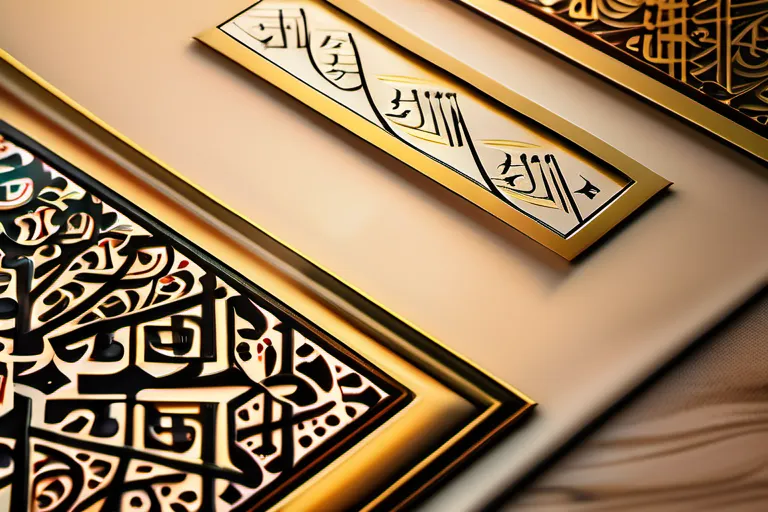
Islamic calligraphy brings written language, skilled design and cultural meaning together. It appears in Quran manuscripts, poetry albums, buildings, official documents and objects of daily life. To understand a work, look at its words, script, material, composition and intended setting.
The religious importance of the Quran helped give beautiful writing a central place in many Muslim societies. Calligraphy also served literary, political and decorative purposes. A manuscript page, a tiled prayer niche and an imperial emblem show how different those uses could be.
Understand the relationship between script, language and context
Calligraphy is the deliberate shaping of writing as an art. In Islamic art, it can carry religious language, poetry, names, good wishes or declarations of authority. Its visual qualities and textual meaning work together.
The Victoria and Albert Museum’s introduction emphasizes both the importance of presenting the Quran accurately and the varied nonreligious contents of Arabic calligraphy. The museum also describes writing across different materials, with decoration, color and changes of scale contributing to the design.
Distinguish the script from the language written in it. Persian calligraphy and Ottoman court writing belong to related Arabic-script traditions while serving their own linguistic and cultural settings. The term Islamic in an art-historical discussion can therefore describe a broad context that needs to be specified for each object.
A useful first question is simply: What does this writing say? Follow it with: Why was this text chosen for this particular place or purpose?
Trace development through specific examples
Calligraphic forms developed over centuries across many regions. Early Quran pages, later proportional scripts, Persian poetry albums and Ottoman documents reveal different requirements and artistic choices. They should be studied with their actual dates and settings.
The Metropolitan Museum’s teaching unit on Arabic script and calligraphy describes the codification of proportional cursive scripts between the tenth and thirteenth centuries. Its account helps place a technical development within a longer history of writing.
For comparison, the Blue Quran folio discussed below belongs to the second half of the ninth through the mid-tenth century. Persian nasta‘liq developed later, and the Ottoman tughra example dates to the sixteenth century. These objects make historical change visible without assuming that one script simply replaced every earlier form.
The six proportional scripts and other traditions
The traditional group often called the Six Pens comprises naskh, thuluth, muhaqqaq, rayhani, tawqi‘ and riqa‘. The Met’s teaching resource identifies these as a particular group of proportional scripts. They are part of a larger field that also includes angular forms commonly described as Kufic and other regional traditions.
Proportion provides a disciplined basis for variation. The same resource explains how a rhombic dot made with the pen can serve as a unit for determining letter forms. A calligrapher works with relationships among shapes, rather than drawing every letter to an arbitrary size.
For a viewer, compare the height of vertical strokes, the width of curves, spacing and the density of the line. Ask how those choices affect rhythm and legibility. A script name can guide looking, but the work itself supplies the details to examine.
Read a manuscript page: the Blue Quran
The Met’s folio from the Blue Quran is made with gold and silver on indigo-dyed parchment. The museum dates it to the second half of the ninth through the mid-tenth century and identifies North Africa as its probable place of copying.
The page offers a striking relationship between the text and its dark ground. The museum notes that letters were adjusted to make lines equal in length and that distinguishing marks between letters were omitted, making the script difficult to read. This gives a concrete example of the relationship between visual organization and legibility.
Look first at the page as a whole: the horizontal lines, the contrast of materials and the space between rows. Then examine individual letter shapes. That movement between overall pattern and written detail helps reveal how a page can operate as both a text and a carefully composed object.
Keep the museum’s attribution precise. “Probably copied in North Africa” conveys a different level of certainty from an exact place of production. Material beauty and historical identification are separate aspects of understanding the work.
Read architecture: the Isfahan mihrab
A mihrab is a prayer niche associated with the direction of Mecca. The Met’s example from the Madrasa Imami in Isfahan is dated 755 AH/1354–55 CE and assembled from small glazed tiles.
The museum identifies Quranic verses around the outer frame, an inscription containing sayings of the Prophet in Kufic around the pointed arch, and a further cursive inscription at the center. Texts occupy different parts of the architectural composition. The distinction between Quranic text and a prophetic saying remains important even when both appear on one object.
Follow the outer border, then the arch and central panel. Notice how scale, placement and contrasting forms organize attention. The writing belongs to a built setting and works with its surfaces and boundaries.
This example also makes the relationship between calligraphy and other crafts visible. Designing written forms for mosaic tile involves fitting letters and patterns to a material construction. The finished result joins textual choices with the practical skills of making and assembly.
Read authority: Sultan Süleiman’s tughra
The tughra of Sultan Süleiman the Magnificent at the Met, dated around 1555–60, is an imperial calligraphic emblem. The museum explains its role in official materials such as decrees and endowment documents.
Its text includes the ruler’s name, his father’s name, titles and a formula of victory. The composition’s vertical shafts and loops make it visually distinctive. The museum also distinguishes the work of drawing the standard emblem from the illumination added to especially elaborate examples.
A tughra demonstrates a different function from copying scripture. Its purpose includes representing sovereign authority through an identifiable written form. Looking at it alongside a Quran folio reveals how calligraphy could serve different institutions and messages.
Ask how recognizable shape and difficult reading can coexist. An emblem may communicate identity at a glance while requiring learned attention to decipher its component words. Its visual and textual functions deserve to be considered together.
Persian poetry and nasta‘liq
The Smithsonian National Museum of Asian Art’s study of nasta‘liq and Persian calligraphy traces the script’s development in fourteenth-century Iran. Its examples connect calligraphic refinement with Persian literary culture and the work of named masters.
The study includes poetic fragments and discusses figures such as Sultan Ali Mashhadi and Mir Ali Haravi. These examples show how a short selection of verse could become a focus of sustained visual attention. The chosen lines, their arrangement and the calligrapher’s handling of the script all contribute to the work.
When studying such a piece, seek a translation and identify its genre. A poem requires a different approach from a religious inscription or decree. Understanding the words adds another dimension to the visual experience.
Tools, materials and disciplined practice
The Met’s teaching resource describes reed pens cut to suit the script, the preparation of inks and the use of writing surfaces including parchment and paper. The pen’s cut affects the marks it can make; the surface affects how those marks appear.
Material identification should remain specific to an object. The Blue Quran folio uses parchment, the Süleiman tughra uses paper, and the Isfahan mihrab uses glazed tile. These are different forms of production, with different demands on the people making them.
For a beginner, a useful exercise is to follow a teacher’s model of a single letter or short word. Compare stroke direction, relative size, spacing and the relationship between parts. Repetition becomes more informative when you can identify what changed from one attempt to the next.
Learn the meaning and writing conventions of a text before attempting an elaborate composition. Accurate copying, language knowledge and visual design support one another. A decorative arrangement deserves the same attention to what the words actually say.
A living practice across media
UNESCO inscribed Arabic calligraphy: knowledge, skills and practices on its Representative List of the Intangible Cultural Heritage of Humanity in 2021. Its description includes transmission through formal education, informal learning and apprenticeships.
UNESCO also identifies both traditional materials, including reed and bamboo writing instruments, and contemporary media such as markers, synthetic paint and spray paint. The entry describes calligraphy in settings ranging from carving and embroidery to work on walls and buildings.
This living range can be studied through the same questions used for historical objects. Identify the text, maker, medium, audience and purpose. A contemporary work may explore a new setting while also inviting comparison with established letter forms and methods of composition.
Digital reproductions provide another route into study. Museum object pages let readers examine documented works alongside information about materials, attribution and dating. Use that information to guide observation, while remembering that a screen image conveys only part of an object’s scale, surface and physical setting.
Conclusion
Islamic calligraphy is best understood by bringing close looking together with careful reading. The Blue Quran folio, Isfahan mihrab, Süleiman tughra and Persian poetry examples reveal distinct relationships among script, material, religious meaning, literature and authority. Learn the words and context, examine how the forms are made and keep historical attributions precise. This approach makes calligraphy understandable as skilled writing, visual composition and a continuing cultural practice.
Published by Ralf. About our editorial process.